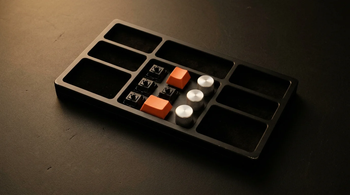
Stop Keeping Pretty Components Nobody Uses: Pruning a Live Design System
Hundreds of specimens sound impressive in a headline, until you cut generic mega-menus, lookalike widgets, and stray tab scrollbars that dilute the craft.
There is an easy trap when building an interactive component playground: falling in love with the headcount. Early on, I was tempted to showcase every category imaginable—dozens of mega-menu headers, redundant dashboard sparklines, repetitive media cards, and playful little widgets. Yet the moment I opened the page with fresh eyes, the flaw jumped straight off the screen. Scrolling past lookalike headers and generic fillers actually dilutes the standout tactile pieces right beside them.
The very first batch I removed without hesitation was website mega-menus. A multi-column link dropdown with a decorative promo card offers nothing special to inspect, teaches nobody anything about micro-interaction craft, and takes up massive grid real estate. Next went repetitive chart clones and novelty toys. When another designer or product lead opens a UI/UX playground, they want to touch pieces that teach something about state, physics, and clarity—not browse filler.
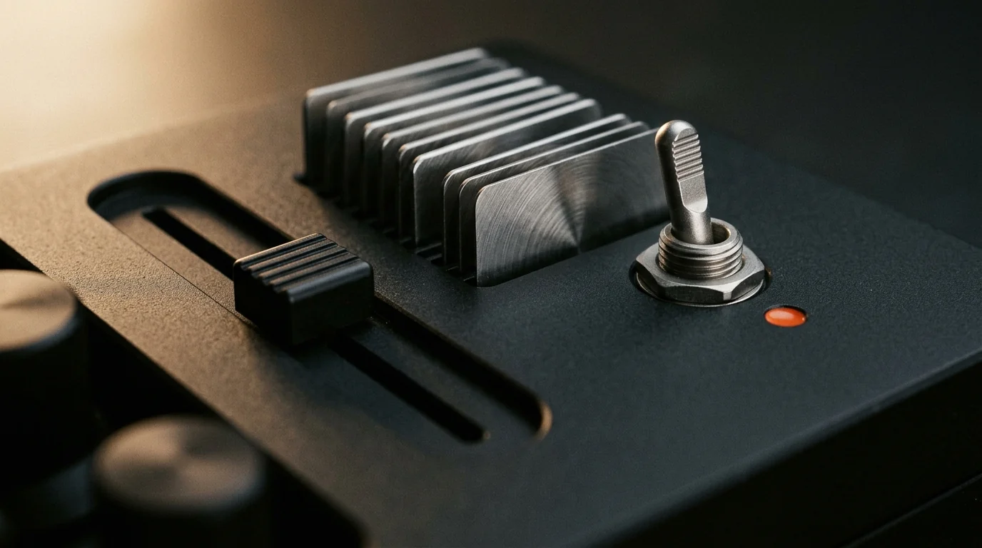
Three Questions That Decide What Stays
While auditing the collection line by line, every component had to justify its spot against three honest checks:
- Does it demonstrate real tactile or interaction craft? A button with calibrated detent compression or a command omnibar with live token filtering earns its frame. Three nearly identical notification cards with swapped labels do not.
- Would I actually ship it inside a client product? Novelty puzzles look cute for three seconds in a demo reel, then get torn out in real usability testing. Real-world readiness beats gimmicks every time.
- Does the grid stage give it honest room? Spacious two-column search bars and multi-step forms suffocate inside narrow four-column cards. Giving complex modules breathing room immediately elevated how usable they feel.
A serious design system is never judged by how many files sit in its directory—it is judged by how few compromises hide inside what remains.
The Tiny Bug That Ruins Sticky Polish: Stray Scrollbars
Alongside cutting filler components, one small detail bothered me every time I inspected the sticky control deck: a thin horizontal scrollbar cutting right beneath the category tabs on narrower screens. Even when tokens, typography, and motion feel tailored, a clunky browser scrollbar instantly breaks the illusion of hardware precision. Switching the tabs to clean wrapping rows and suppressing stray overflow tracks made the entire header feel calm and deliberate.
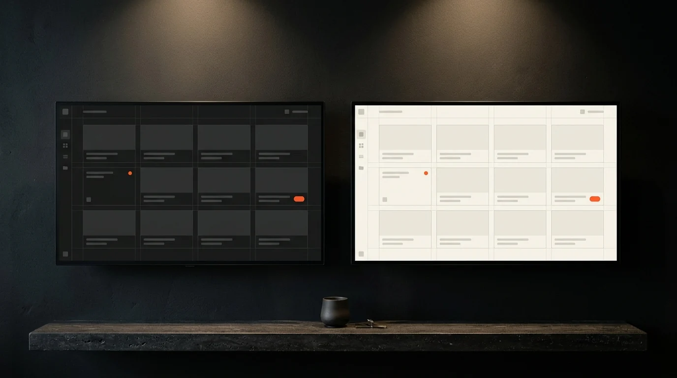
Deeper Inspection Over Bigger Counts
Once the noise was cleared out, adding a dedicated spotlight modal with live CSS token readouts and one-click code snippets actually mattered—because every specimen inside the grid deserved a closer look. Pruning aggressively gave the strongest pieces room to speak, and made maintaining dark/light contrast, RTL parity, and tactile spring feel across the whole system genuinely sustainable over time.

One Typeface, Strict Weights: My Obsession with Clean Persian UI Typography
Bilingual interfaces often collapse when designers stack mismatched fonts, leave Latin letter-spacing on cursive glyphs, or litter Persian layouts with // dev tags.